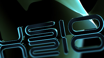
But then the emotion changed. And I felt like I should give a "re-birth" to the logo. The "F" logo on the Fusion Website and all the animation's I have done in past incorporated the same sorta 2-D look with some 3-D elements, and now it's full blown 3-D with a sleek, elegant style giving the brand an updated look.
So I decided to reflect the standard "F" Fusion logo in the New logo and then zoom out revealing the new logo, like showing the Fusion brand "breaking out" of it's boundaries as an Internet Radio Station.
Here are some results:
.jpg)
.jpg)

No comments:
Post a Comment